Saturday, April 30, 2011

My poor flower

I did a little switch-a-roo.

I used to have this little teal sand timer on our nesting tables:


One day while I was at Marshalls, I saw this cute little teal ceramic flower for $6. So home it came with me, and low and behold, the timer got replaced by the flower. Don't feel too bad for Mr. Timer though, he found a new home on our master bathroom floating shelves (I will get around to posting the details of the master bathroom...one day!).

I just felt that the timer felt a bit too modern for the space, while the flower evokes more of that casual cottage with a hint of elegance charm that I am going for in the living room.


Plus, I liked how it complimented the white ceramic flower sitting on the other side of the room:


Shortly after getting this sweet little teal flower, I declared to Nick that it was my favorite little detail of the whole house. Little did I know it's fate was doomed.

Probably not even a week after taking the above pictures, the teal flower suffered a mighty fall. I take full blame. I was carrying a long trellis from the backyard, through the house to the front yard (I will blog about our landscaping adventures at some point as well!). I should've just gone straight through the house and not bothered to shut the back door, because when I turned to close the door, the trellis turned with me and knocked over my beloved little ceramic flower.

Really, I was somewhat lucky (if you want to call breaking your favorite accessory lucky) because it really only broke in two obvious places.

It chipped on the top leaf:


And on the backside, one leaf was completely shattered. I asked Nick in my sweetest possible voice to please try to super-glue my shattered leaf back together. He gave it a good effort, and this is what he was able to accomplish:


He actually pieced most of it back together, but unfortunately, we never could find that middle part.

So we started our search for a replacement. We went back to Marshalls, but unfortunately they didn't have anymore. Those type of stores are great for finding cheap accessories, but unfortunately they offer no guarantee of having large quantities a certain piece in stock. I checked their website, and discovered that they don't even sell things online, probably because every store has different merchandise.

Through our little search effort, I discovered we only have one Marshalls within a 40 mile radius. We did drive to one store about 45 minutes away, and they didn't have any more either.

So I sulked for a couple of days. I am not one to want to give up when I have my mind made up about something. And my mind was made up: this was THE accessory I wanted for my nesting tables. Surely there was some way I could fix it.

Thank goodness for my good friend Google, who offered plenty of how-to's on fixing broken ceramics. They suggested filling in the gaps with wall putty. So I gave it a try.


It goes on pink:


Then dries white:


Then they suggested painting the spackle with basic acrylic paint. So I got to mixing and tried to get the color as close as possible. Afterwards I sprayed the whole thing with a little clear sealant.

Here are the results:


I am the first to admit that it is by no means perfect. But it is fixed enough that it doesn't bother me. I feel like most people wouldn't notice it unless they were looking for it. Especially since I keep that side turned toward the lamp, so very rarely will anyone ever be at an angle where they look at that leaf straight-on.


Oh and as for the little chip at the top of the flower, I just painted it with some of the paint, and it blends in quite nicely now.


Its not perfect, but it is a solution. (And if anyone is ever shopping at Marshalls and happens to find this flower, I'd love you forever if you'd pick me up a new one.)

Monday, April 25, 2011

Modernizing the ceiling fan

As promised, a quick post about the little DIY fan project we tackled this weekend.

We have fans in every single bedroom, plus the living room. And we live in Texas. So as much as I would loveto replace the fans with some fun and stylish light fixtures, this is one instance when function wins over form. We need our fans. :)

But surely there is a way to modernize these very standard, ho-hum fans, right? Surely we can do better than those four little standard glass covers, as seen in the picture below:


We followed the instructions from this post from Thrifty Decor Chick and removed the glass shades and added a basic white lampshade for an instantly updated, modern look.


If you are looking for a how to, I would recommend reading the Thrifty Decor Chick post. To be honest, I still don't quite understand how it was done. Nick was the brainchild behind this operation. I was just the idea person :)

But anyway, I really like how the fan now complements the modern lines of my new entryway light, rather than detracting from it.


I am still debating the size of the shade. Should I try to find one that is shorter lengthwise? Does the shade seem disproportionately large? The scale looks about right in the pictures (especially next to the entryway light), but I keep doubting the scale in person. Thoughts?

Sunday, April 24, 2011

This little light of mine

You may remember that I had debated between a couple of light fixture options for our front entry. Here were the top contenders:


You may also remember that I wrote that the Garden District mirrors I purchased for the mantle helped me solidify my lighting decision:


So, any final guesses which one it will be as Nick takes down that awful builder-grade light? Anyone?


And the winner is...


The Eldridge Pendant from Ballard!

In the end, the first option (the lantern) felt a bit too heavy. I felt the Eldridge Pendant gave the same "old world lantern" vibe, but in a lighter, more modern way. I love the last option of the sphere fixture (in fact, I am pretty sure I am going to buy it for the front porch), but it just didn't seem to tie in as much with the space. I felt the iron on the Eldridge Pendant would compliment the iron on the mirrors, tying the living and entry spaces together.


Since I took these pictures I also have addressed the fan (pictured above). Just a simple (and cheap!) DIY project which modernized the fan's light shades. Hopefully I can get some pictures of that tomorrow and post it for you. You'll just have to wait and see.

So for tonight I will leave you with a little before-and-after:
Before:


After:

Keep on shining

So we have some updates on the lighting front: the terribly puny outdoor light is now gone!

The sad, little light of the past...


...has now been replaced with this:


It was kind of a spur of the moment purchase while at Lowes a couple of weeks ago. We are usually Home Depot people, so I hadn't seen Lowes' lighting selection. But while we were there shopping for plants (more on that later!), I realized they had some really attractive outdoor lighting options for very reasonable prices. We picked this one up for about $35. Who would've guessed such a cheap change could elevate the exterior so dramatically?


When deciding on the style of the light, I tried to pick something that would compliment the "rustic cottage" vibe of the house. But I also wanted something with modern lines. The square shape with the clean lines reads "modern," while the oversized lantern top reads "rustic cottage," so this lamp seemed to be the perfect fit. We both love how it looks on the house!


And in case you are wondering, Nick had no problems installing it at all. But that may be because he had already had "practice" installing another light fixture earlier that day. That post is up next! :)

Tuesday, April 19, 2011

Farmhouse chic

I finally finished my DIY curtains for the breakfast nook last night, which means its finally time for the "breakfast nook details" post.

We'll start (fittingly) with the table.


We bought this table from IKEA last year. Sometimes when I buy things from IKEA, I don't feel like they are "real" furniture. It feels sort of like low-quality placeholders. (The major area where I feel like this is true is in our bedroom. We have had an IKEA bed/dresser/night table set for nearly 3 years now. And while I love the aesthetics of it, I am itching to get some quality, "real" pieces. But that is a whole 'nother post!)

I digress. My point was that sometimes I feel like IKEA is a low-quality placeholder, but that is so not the case with this table. It is extremely durable and I feel like it will hold up throughout the years. This table is so my style. It has a "cottage" vibe, but is still modern. And its white. Why am I such a sucker for white furniture? I really am trying to veer away from the white furniture, but I keep getting drawn back.

One great thing about this table is you can change up the chairs to give it a completely different vibe. In our rental house, I paired it with some leather parsons chairs, which had a much more formal look.


But lately I have really been liking the "cottage" vibe, so when we moved I decided to redecorate using more relaxed accessories.

So as I already mentioned in a previous post, we bought some light wicker chairs from (where else?) IKEA, and I spray painted them brown. They weren't terribly comfortable, and I also felt there needed to be a little contrast against the brown, so I repurposed some seat cushions I already had from (where else?) IKEA.

The cushions had velcro tabs that would attach to the legs of a chair. Since these wicker chairs don't have "legs," I had to get creative when thinking of a way to attach the cushions. So I ended up cutting the velcro off and sewing a strip of white canvas directly over the are where the velcro tabs were, then tied the canvas around the back of the chair.


They don't look perfect, but I kind of like the "homespun" vibe.


So for people wondering how I come up with my decorating ideas, let me let you in on a little secret. Quite often, its just a copy of something I've seen in a catalog. I've started keeping a collection of "inspiration" sheets that I tear out of catalogs. One night, I needed an idea for our table centerpiece. So I looked through that inspiration pile, and found a West Elm table with an almost identical arrangement: white hydrangeas in a rustic "barnyard wood" type box. I remembered seeing a similar box at Marshall's, so I went and got it, then bought some faux flowers from Michael's. Nick did have to alter the box some. It originally had a lid, was much wider and took up too much space on the table. So he took the box apart, sawed it down some, then nailed it back together. Now its the perfect size!


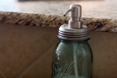
I ordered these salt and pepper shakers and a matching soap dispenser from Etsy. All three are made of repurposed mason jars, which gives a great "cottage" vibe.


I love this new runner. It really warms the space up. The color and material compliment the "cottage" style, but the graphic pattern keeps the whole space feeling fresh and modern.

And I must say, I am getting much better about mixing and matching patterns! Case in point, my new DIY roman shades:


I was going to buy the same cream roman shades we have used in the living room and bedroom for this nook too. Actually, I did buy the cream roman shades for this spot. But they were an inch too wide for the windows, and it looked like I would have to custom order some to fit. Which I was going to do. Then, once I saw Nick's wonderful woodwork around the windows, I just felt cream curtains would be so "blah" against the white trim. All of a sudden, I was thinking teal. Patterned teal.

I didn't feel like searching retail for this. I just knew it would be next to impossible to find exactly what I wanted. So then I got to thinking.

I'll let you in on a little fact about me: I am totally a "natural light" type of girl. Its actually a pet peeve of mine when people close their blinds up to keep out the sunshine. Let it shine, baby. I don't want to have to turn on a light until it is pitch black outside.

So I knew that these shades would never actually be used as shades (especially since these windows face out into our fenced in backyard). The shades are just there basically to finish up the space and make it look good.

So that got my wheels a turnin'. How hard could it be to make shades, if they don't actually have to function? I mean, isn't it just a little fabric hanging from a stick?

I guess God was on my side on this project, because I found a modern teal patterned fabric very easily at our local fabric store. And it was half off! We got all of it for about $30, which is a steal compared to the price we were going to pay for the cream roman shades.

I just cut the fabric to size, "hemmed" up the raw edges with iron-on fabric tape, then folded and sewed horizontal sections to hang like roman shades. I have debated whether I should add blackout liner to the back, because, as you can see in the pictures, the sun definitely shines through. Which isn't a problem for me light-wise (I've actually been complaining since we put the shades up that it is blocking too much sun!), but I worry that it looks cheap to have the sun shining through. The jury is still out on that decision, so for now this is how they will stay.


I think the pattern adds a level of interest, and I am proud of myself for taking a risk and adding some pattern! Man, I have all sorts of patterns going on in our kitchen/nook/living room now! But they are all tied together by color, so its working. Am I finally tackling my "matchy-matchy" demons??


HOUSEography House Tour Link Party

Monday, April 11, 2011

Lucy's gift:

If you are the type that really pays attention to details, you may have noticed in the previous post that there was a little something extra on the wall in the breakfast nook.

We fulfilled a lifelong (yes, lifelong--as in, the span of Lucy's life) dream of having a doggie door. There was a good deal of discussion as to where this would go. I wasn't willing to give up my full-glass door to the patio in place of a solid door like this:


We quickly realized we would have to get a "through-the-house" type door. But I wanted it to be disguised as best as possible since, lets be honest, doggie doors are ugly. So that meant the living room was definitely nixed. We talked a bit about installing it in our bedroom, but we finally decided to do it below the window in the breakfast nook because I hoped that the board-and-batten might camouflage it a bit. Plus, its a good location that is in our main living space, but is hidden away enough that you don't see it from most angles of the entryway/living area.

So a few weeks before we started the breakfast nook woodworking project, Nick cut a hole in our house (!!!) and installed the door one day while I was getting my hair cut (which explains the lack of pictures). He said it was surprisingly easy. And we have loved that doggie door since. We smile everytime we hear Lucy go through it (rather than scratching and whimpering at the door for us to let her out). Yay laziness!

And for those of you who are wondering, Lucy just loves her doggie door.


And I was very pleased that I was able to paint the big black surround white, to help it blend in more with its surroundings.


And here is a view of the doggie door from the back, demonstrating yet another reason why we picked this spot. There is a perfect little patch of porch under that window:


Isn't it funny how the most enjoyed things can sometimes also be the least attractive? That doggie door has brought much joy to both owner and dog alike.
 

Copyright 2008 All Rights Reserved Revolution Two Lifestyle theme by Brian Gardner Converted into Blogger Template by Bloganol dot com